紙のメタファとは?
紙のメタファのバリエイションには、以下のようなものがあります。
- 手紙、レター
- 段ボール
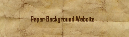
- 古紙(汚れたり、やぶれたり)
- ノート、ルーズリーフ、リングノート
- メモ書き、付箋
- 本、手帳
- タグ
そもそも、紙と文字というのはとても相性がよいものです。
また、ページをめくる、やぶれる、メモを残すなどアフォーダンスを利用しやすいので、工夫次第でいろんな表現ができる素材です。
みなさんも、紙をメタファしたサイトを作る際には、これから紹介するサイトでどのように、表現に使っているかを、参考にしてみてください。
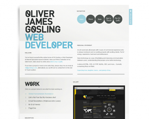
01. Oliver James Gosling
レター風の背景をうまくリピートさせて全体的な世界観を演出しています。
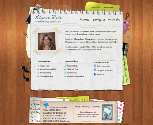
02. Ximena Ruiz online portfolio
リングノート風のコンテナが、ページをめくるアフォーダンスを生み出しています。
紙テープで写真を止めているところがおもしろいです。
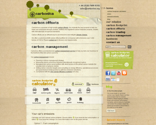
03. Carbonica
段ボールのような背景、すこし汚れたやわらかい紙などが、やさしい全体の雰囲気を演出しています。
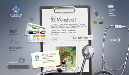
04. Rx Monsters
バインダーというメタファもよく使う手法です。
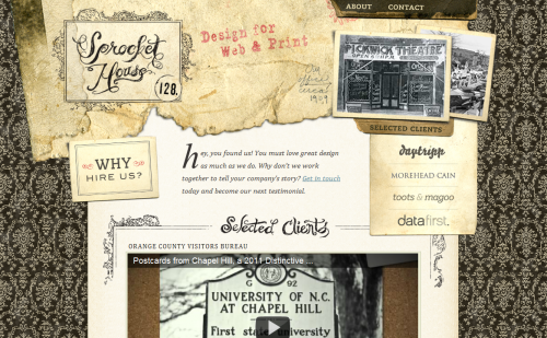
05. Sprocket House
日本人はあまりやりませんが、海外ではやぶれて風化した紙をよく使います。
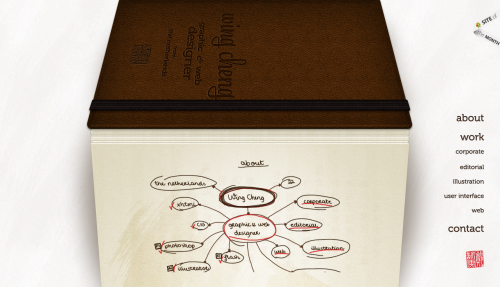
06. Wing Cheng
本のようです。質感がとてもきれいです。
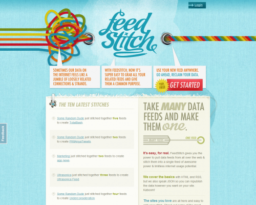
07. FeedStitch
カッコいい♪。ハトメを視線誘導に使っています。
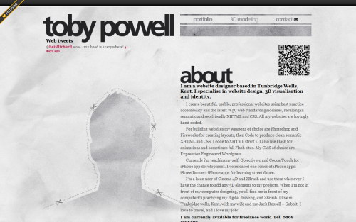
08. toby-powell.co.uk
くしゃっとした紙のテクスチャを背景に使っています。
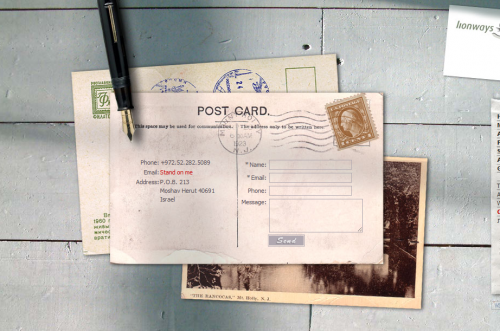
09. Lionways
レター風のお問い合わせフォームです。
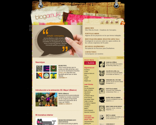
10. Blog Amuki
こちらもヘッダー部分に風化した紙を使っています。
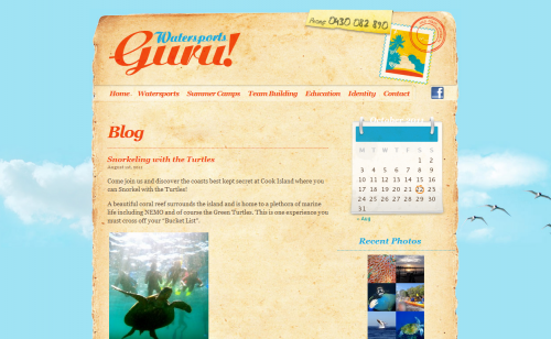
11. Watersports Guru
風化した紙をコンテナに使っています。ヘッダー部分に、切手と消印のアクセントがおもしろいです。
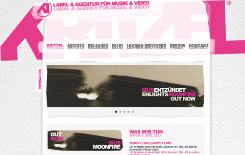
12. KRITZEL
すこし紙をデフォルメして透明感ある質感を演出しています。
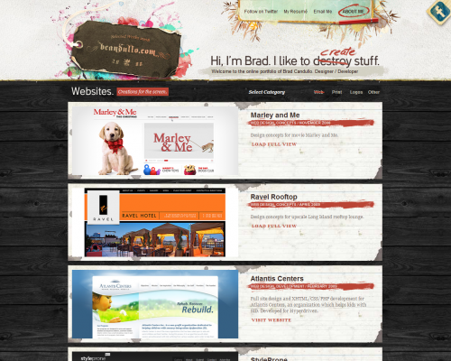
13. Online Portfolio of B. Candullo
ロゴにタグ、記事エントリーのボックスに紙の切れ端を使っています。
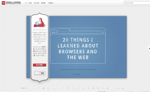
14. 20 Things I Learned About Browsers and the Web
Googleのサイトです。絵本風のレイアウトにより、ページを1ページずつめくるアフォーダンスが生まれています。
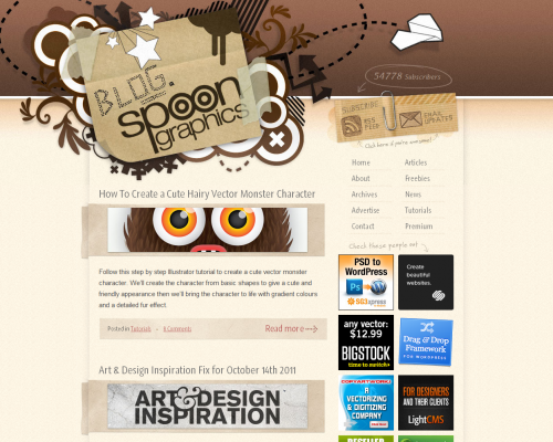
15. Blog.SpoonGraphics
段ボールを使ってロゴがかっこいいです。
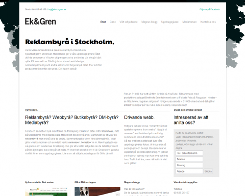
16. Ek & Gren Reklambyrå
なぜか紙に見えます。
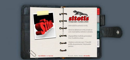
17. Sitotis
こちらはシステム手帳のをコンテナに使っています。タグがメニューになっています。
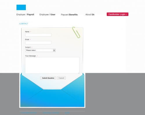
18. asapadvantage.com
レター風のお問い合わせフォームが封筒に入っています。
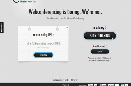
19. LiveMinutes
紙切れにメッセージが残されています。
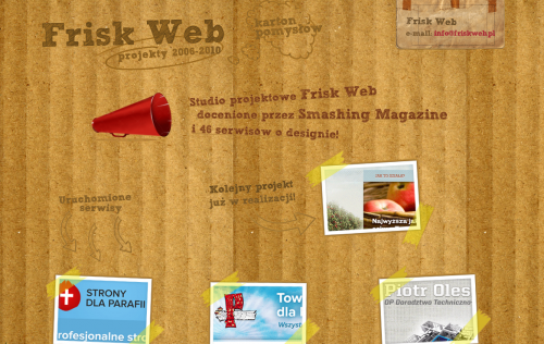
20. Frisk Web. Karton Pomysłów.
段ボールがかっこいいです。
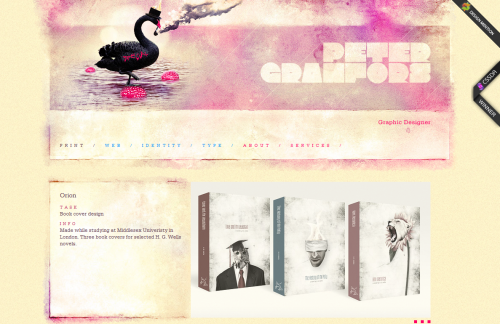
21. Peter Granfors
こちらは色が滲んだ紙ですね。この表現は新しい!。
まとめ
探してみると紙を使ったサイトは結構多いのにビックリしました。
紙を使ったサイトって全体的に「やさしさ」があってとても面白いと思います。
今回紹介したサイトそれぞれにも工夫があるので、
よく観察してみてください。


コメント